A new theme: SC 500
27 Jun 2005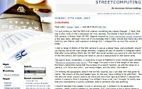
I’m just posting so that the RSS mob realises something has indeed changed. ;) Yeah, that was a joke. Kind of. Not a discussion for now, anyway. The theme is built around my film SLR camera, a Pentax Asahi SP 500. Vaguely inspired by Dale’s somewhat-cynical comment a few days back, although more out of a knowledge that I really should stop being lazy and build my own theme, and a general re-design itch, I whipped this up over the course of today.
I shot a range of photos of the SLR camera to use as a design base, and eventually wound up chosing one as the main design element, cropping off part of another to integrate within that after some editing (that’s the “SC 500″ and serial number you see burnt onto the front of the lens bevel), and scaling one down to use as a background for the search area.
The search area, incidentally, is inspired by a post of Matthom’s a few months back entitled “Attractive, accessible web forms.” The image I’ve used is one of the length of the lense – the theory behind this being that the purpose of a search function, as with the lense on a camera, is to focus and zoom – one being images, and the other, information.
I’m thinking the typography doesn’t feel terribly inspired, but I can deal with that given its clarity. The colours of the post header type, by the way, have nothing to do with Flickr – the link and link hover colours used to be more pink and more light blue before I noticed how similar it looked to Flickr’s branding! I’ve shifted it down a bit, but I thought I’d clarify now that any resemblence is purely incidental, before someone else said anything.
I haven’t decided if the header is cool or annoying yet. I wanted it to be apparently complex, ideally without needing to use images, but I don’t know if this is taking things a little too far – hover back and forwards too quickly and it is a confusing experience. The interface can be simplified easily, but I thought I’d ask for feedback on the weird/trippy version first.
Changes in summary
- IMO cleaner markup than Placid (the previously used theme by Chris Lin)
- Also lighter (bandwidth wise). This theme is a 58KB template, Placid was 130KB. Partially code/markup, but largely images. Reduced use of images in this template will also reduce hits and thus improve loading times.
- Optimised for wider screens: fluid layout, works best from 1024 upwards. Motivated at least in part by my own acquisition of more screen real estate recently
- Built for WordPress 1.5 from the ground up – the first theme I’ve developed myself for this website that’s had that advantage
- Inclusion of a “Recent Comments” section
- 3 column layout using absolute positioning
- “Bright” design, because I’ve been accused of always coming up with darker colour schemes, etc.