New EvolvedHD website: appropriately widescreen!
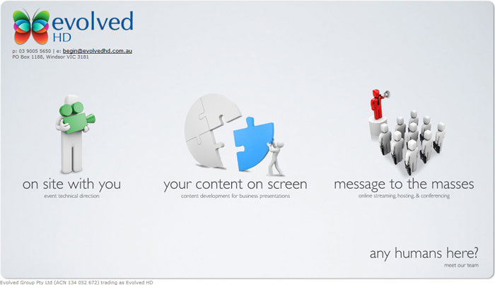
08 Jul 2009My friends over at EvolvedHD just launched a new website for their burgeoning event production empire down in Victoria. It’s a clear, clean microsite with a clear presentation of services offered and an effective call to action with contact information prominently featured on every page (there are only four!)
Notably, the site is very wide (>1200px). As the web evolves we are observing an ever increasing standard width for desktop versions of websites — for some, this poses current issues as individuals gradually shift to widescreen platforms. For others, it represents the inexorable march away from old technologies towards the new!
While this poses certain problems for mobile clients, etc., even these devices are increasingly capable of either linearising or providing useful interfaces (multi-touch, etc.) for making screen content accessible in mobile contexts. Here, the need for good information architecture cries out even louder than technical considerations. Browsing the Internet mobile is an arduous task on even mobile websites, so the best thing you can do as an author is reduce the necessary depth of content to make information rapidly accessible for all user agents.
In the case of the EvolvedHD website, the inclusion of contact details at the top left of every page effectively fulfills all likely applications of their website in a mobile context.
Consider more than just the desktop when designing your website. Increasingly, even low-depth websites are being called upon for mobile access as people seize the convenience of anywhere, anytime Internet. Stop making your users jump through hoops, and start giving them what they want, sooner. It’ll do wonders for your Internet-based business.
