21 Sep 2005
Good times were had by all (and a considerable degree of restraint was shown — we limited ourselves to presentation graphics! Alas, no live vision and replays!), but I didn’t get a chance to take photos. Thankfully, that will soon cease to be a problem. Watch this space.
19 Sep 2005
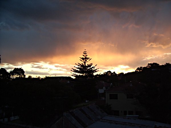
I’ll post source res if people want it.
19 Sep 2005
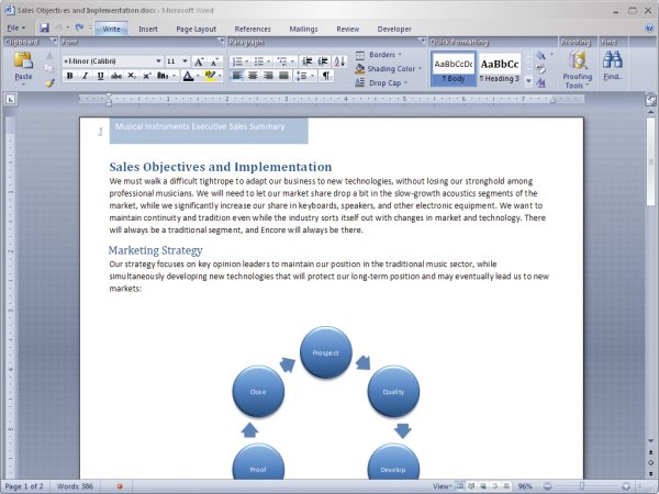
Microsoft have released a series of press images from their Professional Developers Conference 2005, some of which give shots of the new Office platform — creatively code-named “12″ (yes, 2003 was 11). Whilst there hasn’t been much significant change to Office in recent years (dare I say since 97) aside from UI enhancements (2003 did that properly, with a little bit of groupware stuff thrown in on the side), this version looks as if it’s going to break that pattern. Certainly, Vista’s internal font-rendering engine must have something to do with it, but it seems to me from the released screenshots as though Office has changed, also, in the way it handles graphics and layout. Personally, I’m dying to see what justified text looks like in Word.
So, I’m a sucker for graphics. Hopefully this upcoming release will reflect aesthetic advancement in the documents it produces, as well as the interface that surrounds this. (Alas, there appears no hope of Microsoft natively embracing PDF format, as they seek to make Word documents the ubiquitous format. Even if it doesn’t display properly in other versions of the same application, or have font embedding. Doh.)
18 Sep 2005
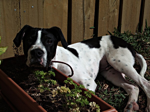
Or maybe he’s not vegetarian afterall… perhaps he was just making use of a garden… bed?
18 Sep 2005
ArtsEdge is a seriously impressive website. Go there, check out the design (stunning, clear), then look at the technical aspects of it — this is the most surprising part. Semantically brilliant markup, even if a little div-heavy, and 100% CSS styling. This is the kind of website that print graphics agencies strive for – only, more often than not, they’re stuck in a fixed-pixel mindset which means no fluid design elements like on this site (e.g. the orange “lick” at the bottom and core content area background element, which displays in full at 1024+ and doesn’t visibly have anything missing at 800×600 or less). Its print stylesheet is also good stuff, trimming everything but the content and core branding itself — not enough websites do that.
As is too often the case with web companies, the agency responsible for this site, Cube7, don’t appear to have had the chance to give their own website this treatment yet. Even so, it’s a great testament to both their capabilities and the design potential of CSS.