Radio silence
19 Aug 2005Until probably Wednesday evening, or thereabouts. Good night, world. Apologies for the lack of quality content lately.

Normal programming will resume shortly.
I’ve delivered simple, clear and easy-to-use services for 20 years, for startups, scaleups and government. I write about the nerdy bits here.
— @joahua
Until probably Wednesday evening, or thereabouts. Good night, world. Apologies for the lack of quality content lately.
Normal programming will resume shortly.
In today’s paper, an article entitled “Wages crack the $1000 barrier“, came this spot of genius.
A pay packet of $1000 a week is no longer anything to brag about.
Full-time adult ordinary-time earnings – the benchmark for Australia’s average wage – rose to $1008.10 a week in the three months to May 31, or $52,432 a year, the Bureau of Statistics announced yesterday.
Full-time women workers are yet to reach the new pay landmark, averaging $906 a week compared with men on $1064.
Right, so, I’m throwing in a disclaimer here. I don’t do maths as a subject, and haven’t for a while. But I think I know how to average two numbers — correct me if I’m wrong. It goes something like “add them together, and divide by two”.
Women earn $906, men earn $1064. That adds to be $1970. We’re already guessing it’s wrong, because it’s impossible to get 10 cents from that. But hey, I’ll do the sum anyway: it’s $985. And no cents.
It seems there’s more than a few workers of dubious gender in Australia…
Ah, it appears Nick has discovered where I went wrong. The ten cents thing did seem a little too… odd… to be straight out incorrect!
Whilst speaking of journalists who don’t bother to check their facts, the SMH’s Razor blog seems to be a tad keen on drawing a distinction between “bloggers” and “real” journalists. You’d think they’d be careful to not alienate their audience (presumably mostly geeks) in this way, but apparently not: the Big Media agenda seems to have come through rather clearly, as fact-checking standards for SMH weblogs are (one would hope — but possibly not) rather less strict than their ‘real’ journalism.
Robert Scoble’s cell phone number has been in the side column of his blog for ages. This wouldn’t be such a big deal if your blog post — I daren’t call it an ‘article’ or anything else that comes closer to ‘journalism’, lest they take offense — wasn’t speaking on the subject of lack-of-fact checking. Caught out by irony, it seems.
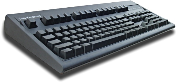
This looks really cool, and logically [the absence of letter markings] makes more sense than perhaps it first seems. Enforced dependence upon memory will remove the need for any consultation with the markings on the keyboard in a fairly short period of time. The creator likened it to the absence of key labellings on a piano, which is… only semi-valid, I guess, as there are only 7 keys on a piano that repeat according to a visible pattern, whilst there are 104 keys on any standard keyboard. Having said that, I completely buy the thinking behind the weighted keys argument, that’s great stuff.
It’s also USB, so anyone wanting to use one with an Apple Mac mini is in luck. But then, it’s black. Not to be racist or anything, but black just doesn’t go with shiny white Apple gear.
Soooo… $US79.95 plus an airfare (they don’t ship to Australia, so I’ll have to ship to them!)… hmm. Tempting, but strangely not, at the same time.