11 Jul 2005
 I’ve heard lots about [Ruby on] Rails over the last several months, but never really bothered to find out what it was about/what it did differently until today, when their website was featured on Stylegala. Yeah, procrastination takes strange forms – I found myself inexplicably drawn to the content of this website, with a desire to discover everything about this system.
Okay, not quite.
I saw a link to a video, and went and viewed that.

It was interesting, surprising, astounding. The “Rails Academy” contains a series of video tutorials, of which I have watched only one that demonstrates how to create a (rudimentary) blog system in under 15 minutes, with something like 60 lines of code. Oh, and you get used to the accent in the video pretty quickly.
I’m really impressed. I’m almost afraid to start using it, because I think I’ll like it so much that there’ll be problems with deployment when web hosts don’t have Ruby/Rails installed! Hopefully I’ll have more to report on this front in a few months time.
10 Jul 2005
I discovered this one today when trying to build a print stylesheet for a website and testing in Opera 7.x on my Linux desktop. Even when a background is set for the body element in the print stylesheet, and the “screen” background is set only for the screen, Opera will insist on obstinantly including the “screen” background when it prints (and, by logical reasoning, should be using the print stylesheet). Apparently this has been filed as a bug by someone else, but I thought I’d rant about it here just because I can.
The closest I can see to a “fix” for this is simply using the following rule, though your mileage may vary, depending on how fancy you want your print stylesheets to look (I like mine plain).
* {background:#fff;}
For most layouts that should suffice.
08 Jul 2005
I stumbled across this post – from about three years ago – today, and thought it was incredibly cool. Note that the background on the second layer in is similarly encoded… nifty beyond.
Via Anne’s weblog in a roundabout kind of way.
Absolutely no idea if any of that works in Internet Explorer… if you’re an IE person and it works/doesn’t work, it’d be great to see a comment…
On an unrelated note, lack of posting over this last week has been due to a Crusaders-run study camp at… somewhere without Internet access… Galston-ish. If nothing else, it was good for the habit/schedule of study and talks throughout the week!
Regular programming shall return shortly… although possibly not until after Trial exams in a month or so.
01 Jul 2005

01 Jul 2005
High definition? Huge disaster? Horrible disappointment? Heinously difficult?
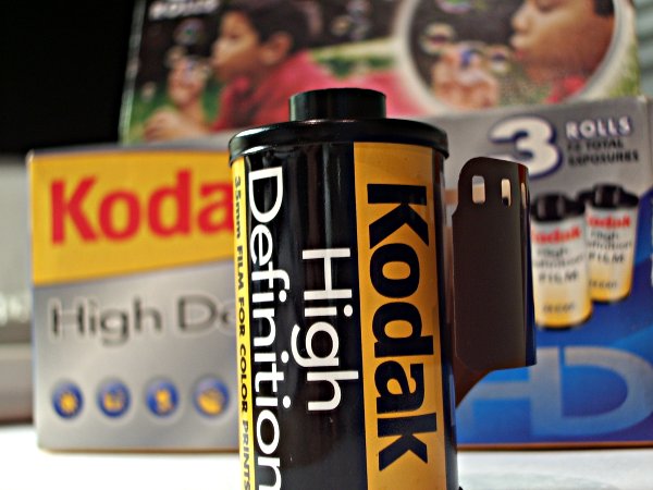
I went to buy a three-pack of 24 exposure 35mm film for my SP 500 today, and, because it was on special (probably because the film expires next month), treated myself to Kodak’s over-marketed offering that I’ve always been a little dubious about. Disclaimer at this point – I don’t think there’s anything technically wrong with the film by any stretch of the imagination. I’m sure it’ll produce great shots. But the branding and marketing of this doesn’t exactly assist the photographer (I so nearly wrote “end user” there – must get out more.) in capturing great shots, at least not in terms of exposure.
To explain: this film is billed as being multi-purpose. It does everything. Apparently. It also does it well. Apparently.
Okay, nothing wrong with that. You could use good quality ISO100 stock to do “everything”, albeit with a little bit of pain. By the same token, this film stock does “everything”. It’d just help if I’d known what I was using before I got home and had time to look up the specs online.
The bottom line is this: on the exterior packaging there is absolutely no mention of the speed of the film enclosed, aside from fleeting comparisons to other Kodak products, saying “look, this is better, it does more stuff” – never mind that if you inspect closely it’s actually slightly different stuff. Deceptive marketing certainly plays a part in the problem.
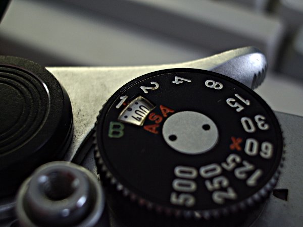
So, I couldn’t find information about that anywhere on the packaging. I loaded it into my camera and ran off a roll of it, with the ISO speed set to 400 (that’s something I’d personally consider fairly useful, if not overly versatile – certainly something I’d consider probable if they’re marketing a consumer brand high-quality stock), trying not to worry too much about it.
Yeah, a recipe for disaster.
I got home, checked Kodak’s specs, and it turns out the film was ISO/ASA/DIN/whatever you want to call it 200 speed film. Nothing I can do about it now, of course, apart from hope that post-processing will be able to clean up the underexposed mess. I went and had a closer look at the cartridge after I’d thought about it for a bit, and it does say the speed on the side of it – but of course, I didn’t think to check this until I’d already wound the film on, so even had I thought of it at the time it wasn’t the best option.
Why can’t film manufacturers label their products more thoroughly and cut down on overhyped marketing that fails to actually inform the consumer of what their product is?